Pictorial and Tabular Methods in Descriptive Statistics
Stem and Leaf Display
Advantages:
- Useful for displaying the relative density and shape of the data, giving the reader a quick overview of distribution.
- They retain (most of) the raw numerical data, often with perfect integrity.
- Useful for highlighting outliers and finding the mode.
Disadvantages:
- Only useful for moderately sized data sets (around 15-150 data points).
Not sure if there’s any advantage over histograms.
Dotplots
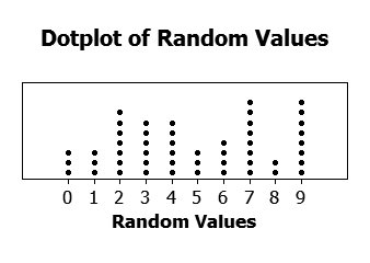
Advantages:
- Compared to a histogram, the x-axis need not be spaced uniformly.
Good for small to moderate sized data sets.
Histograms
Note that histograms are different between discrete and continuous data.
For continuous variables, we have to decide how many classes there should be. Too few and you hide interesting details of a distribution (e.g. a bimodal distribution could look like a unimodal one). Too many and you start seeing statistical noise.
A rule of thumb is to use roughly the squareroot of the number of observations for the number of classes.
Usually your class widths are of equal size, but it may be desirable to have unequal widths when you have outliers. If you go this route, though, be careful about the rectangle height. Ultimately, the area of the rectangle is representative of the count. In general, use narrower widths for regions with more data, and wider widths in regions with less data.
Histograms are useful in showing the distribution of your data.
Common distribution shapes:
- Unimodal
- Bimodal
- Multimodal
- Symmetric
- Positively skewed (tail longer/fatter on the right)
- Negatively skewed
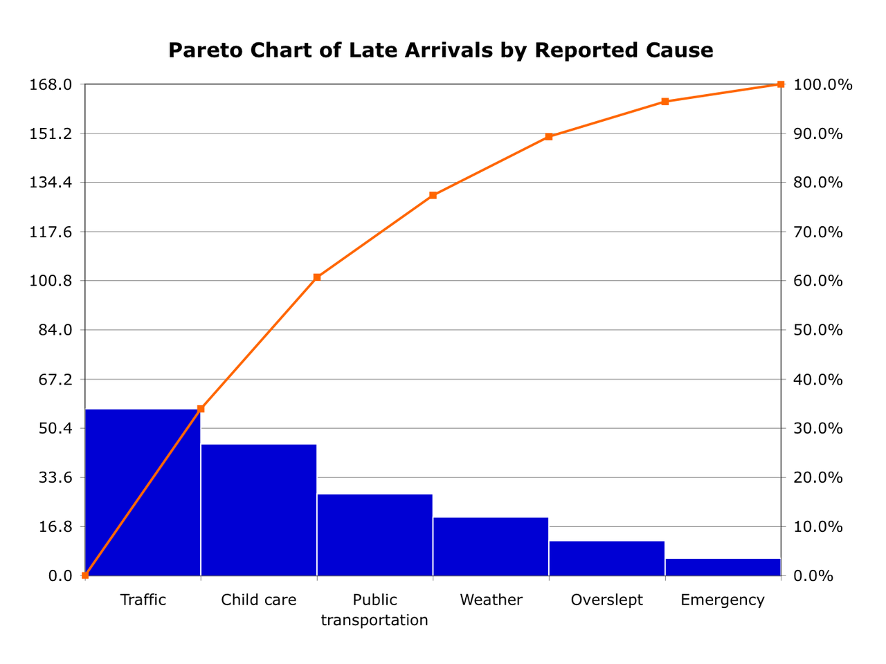
Pareto Diagrams
Pareto diagrams are like histograms for categorical data. The first entry on the x-axis will be the most common, and so on. It also has a line plot showing the cumulative value. An example is simplest:
Boxplots
Boxplots are useful in showing the spread of data without outliers heavily playing a role.